Final Project Analysis
Composition
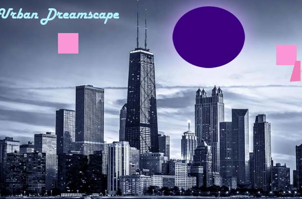
When I was putting this together, I mainly wanted the picture to feel balanced and not random. I placed the big purple circle above the center of the city so it would immediately draw attention, because I liked the idea of something huge floating over the skyline. The cube on the right is there so the image doesn’t feel empty on that side; it helps even things out. I also tried to make sure the objects didn’t block anything important in the buildings. The title in the upper-left is just where it felt natural to put it — visible, but not in the way. Overall, I just arranged everything in a way that looked pleasing to me and kept the scene from feeling lopsided.
Use of Color
For the colors, I wanted the whole thing to feel dreamy and not like a normal photo. That’s why I used a cool blue gradient map over the city — it instantly changed the mood and made the whole thing look more surreal. The purple circle stands out a lot against the blue, and that contrast made it feel more “magical,” which I liked. The cube being pink adds another pop of color so it doesn’t blend in with the background. I wasn’t trying to follow any strict rules; I just picked colors that felt different from the original photo and made the surreal parts stand out more.
Use of Lines
The lines in the original photo actually helped guide what I did with the shapes. The tall buildings already pull your eyes upward, so putting the circle above them just felt right. The cube’s slanted side adds a diagonal line, which breaks up all the straight vertical and horizontal lines in the skyline. I think the clouds also help guide your eye across the image because of the long, soft streaks they have. I didn’t overthink it too much — I just noticed how the lines were flowing and tried to place my shapes in spots where they connected with that natural movement.
Use of Shapes
Shapes were the main thing I used to make the piece surreal. I liked how the circle felt totally different from the buildings because it’s simple and smooth while the skyline is full of angles. The cube was fun to make because once I distorted the side, it actually looked 3D, like it had weight. Making that side a bit darker helped it look more realistic. Using these bold geometric shapes made the scene feel more interesting and helped me get that dreamlike vibe I was going for. Honestly, the shapes are what turned the normal photo into something surreal.